


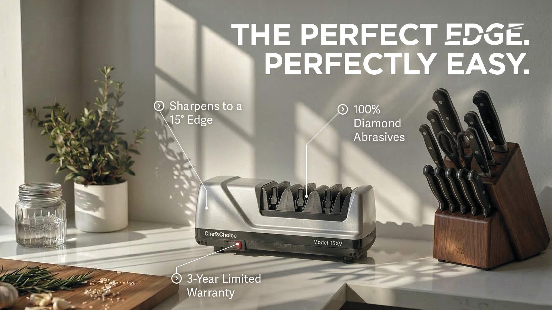
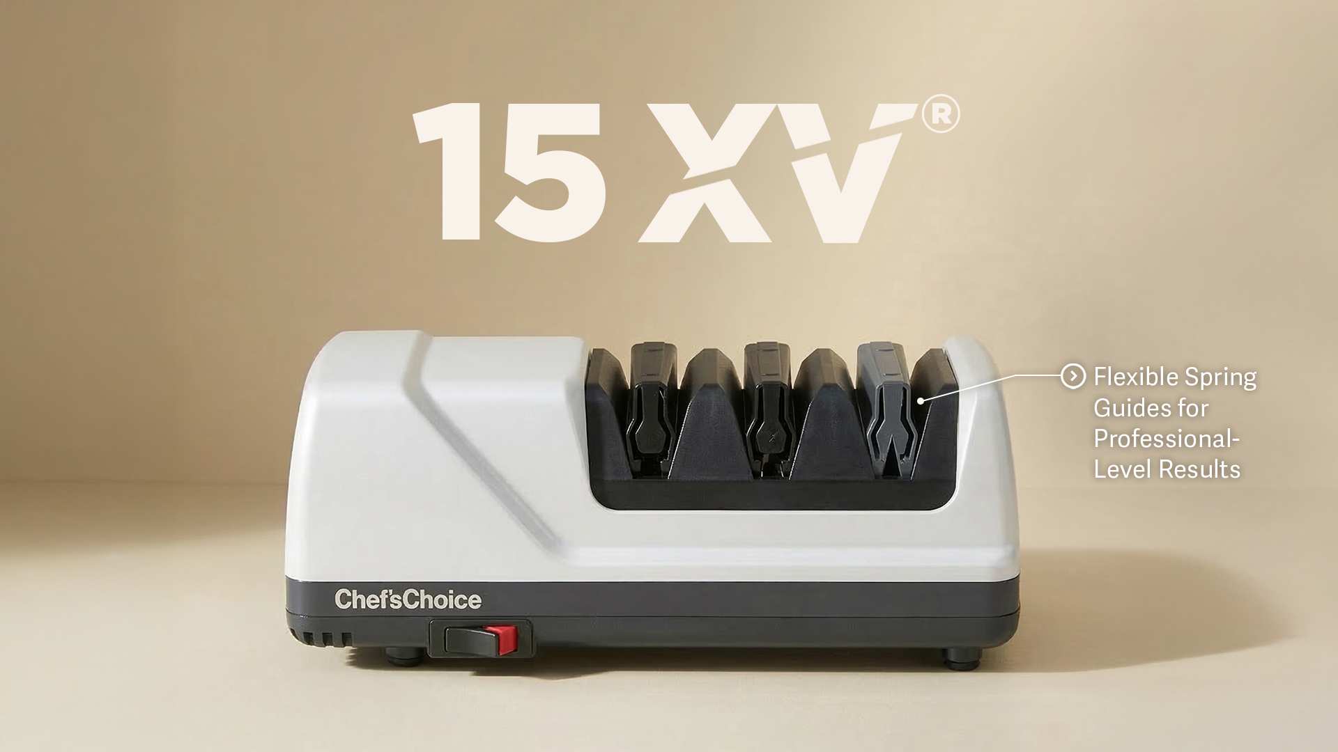
A great knife makes everything in the kitchen feel easier. But knife sharpening? That can feel like a skill you need to master before you even start cooking.
Chef’s Choice had an opportunity to change that. The brand’s engineering gave us plenty to talk about. Our job was to make people care about what it meant for them.
We brought ease to the forefront, connecting precision sharpening with the everyday pleasure of cooking. Less effort at the cutting board. More confidence with every slice. Messaging that gave the technology a clear purpose and the brand a more inviting voice.
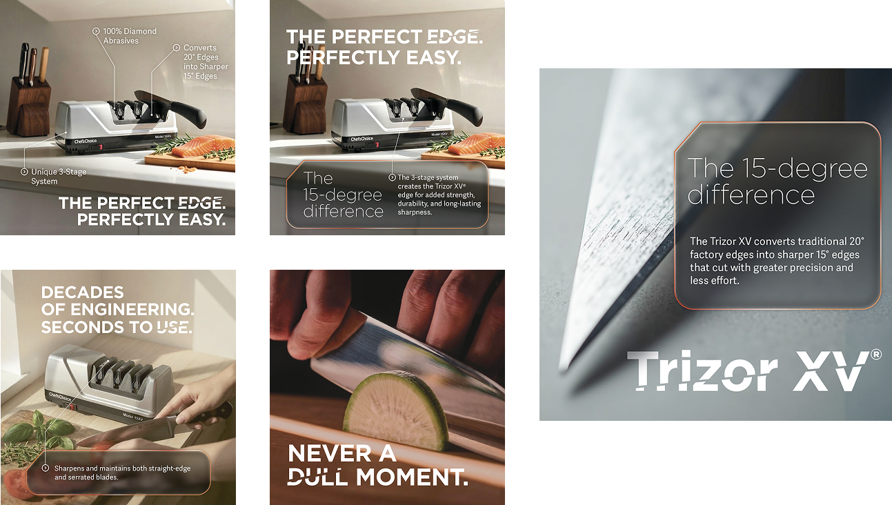
A new brand positioning demanded a new look. One that made the promise of professional results and simplicity feel relatable and effortlessly attainable.
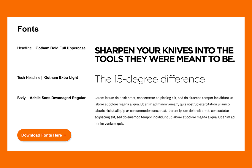
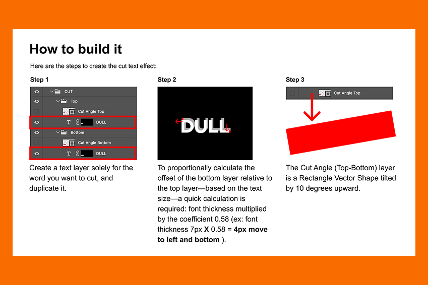
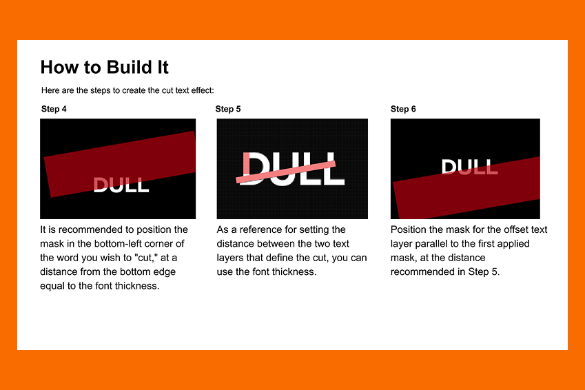
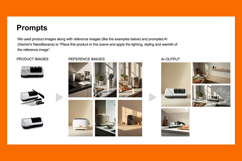
Warm kitchen settings and appetizing food photography put Chef’s Choice where it belongs: in the middle of making something good. Bold typography gave the messaging presence. Product close-ups brought the engineering into focus.
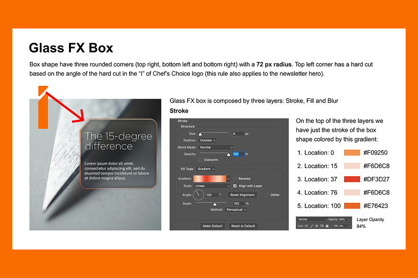
We pulled those elements into visual guidelines that connected the brand’s technical expertise with a warmer, more approachable feel. This created a clear direction for bringing product stories, campaign creative, and digital touchpoints together.
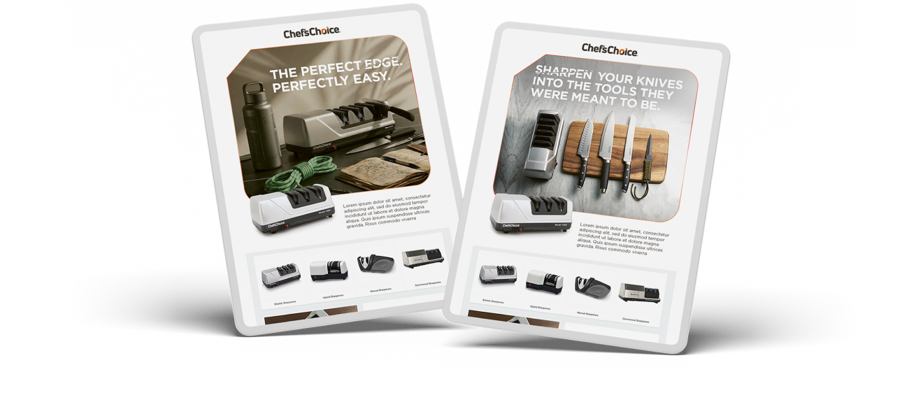
It would have been easy to rely on speeds and feeds to explain what makes Chef’s Choice different. But we also needed to engage the emotional side of cooking. Not an easy feat when you’re battling it out on e-commerce sites.
We helped Chef’s Choice connect the two, pairing a confident visual look with messaging that made its expertise easy to appreciate. In short, we created a sharper expression of what the brand brings to the kitchen, and a simple reason to make it part of yours.
Tell us what's on your mind. We'll come back to you within one business day.